The renewed Paardekooper webshop can now be admired live. We explain the biggest changes.
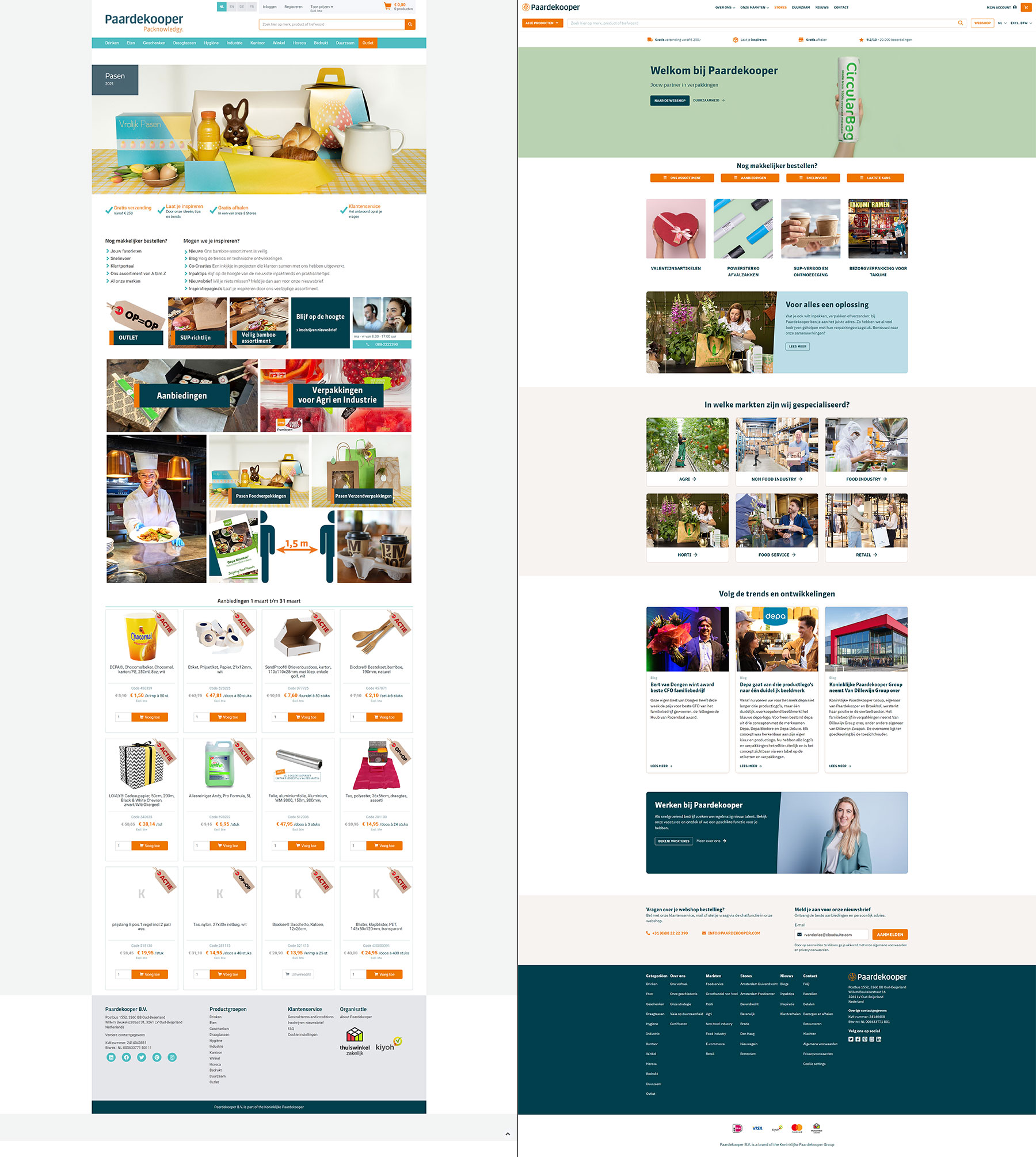
What is immediately noticeable in the new design of the homepage is the calm appearance compared to the old design. In the old situation (left) you already see products being presented on the homepage, where on the right there is much more emphasis on supporting content to tell the visitor more about Paardekooper and the solutions they offer.
Instead of landing in the webshop immediately as a visitor and being confronted with products, Paardekooper now chooses to first introduce itself, position and emphasize what they can do for you when you decide to become a customer. A very customer-friendly approach that suits this time.
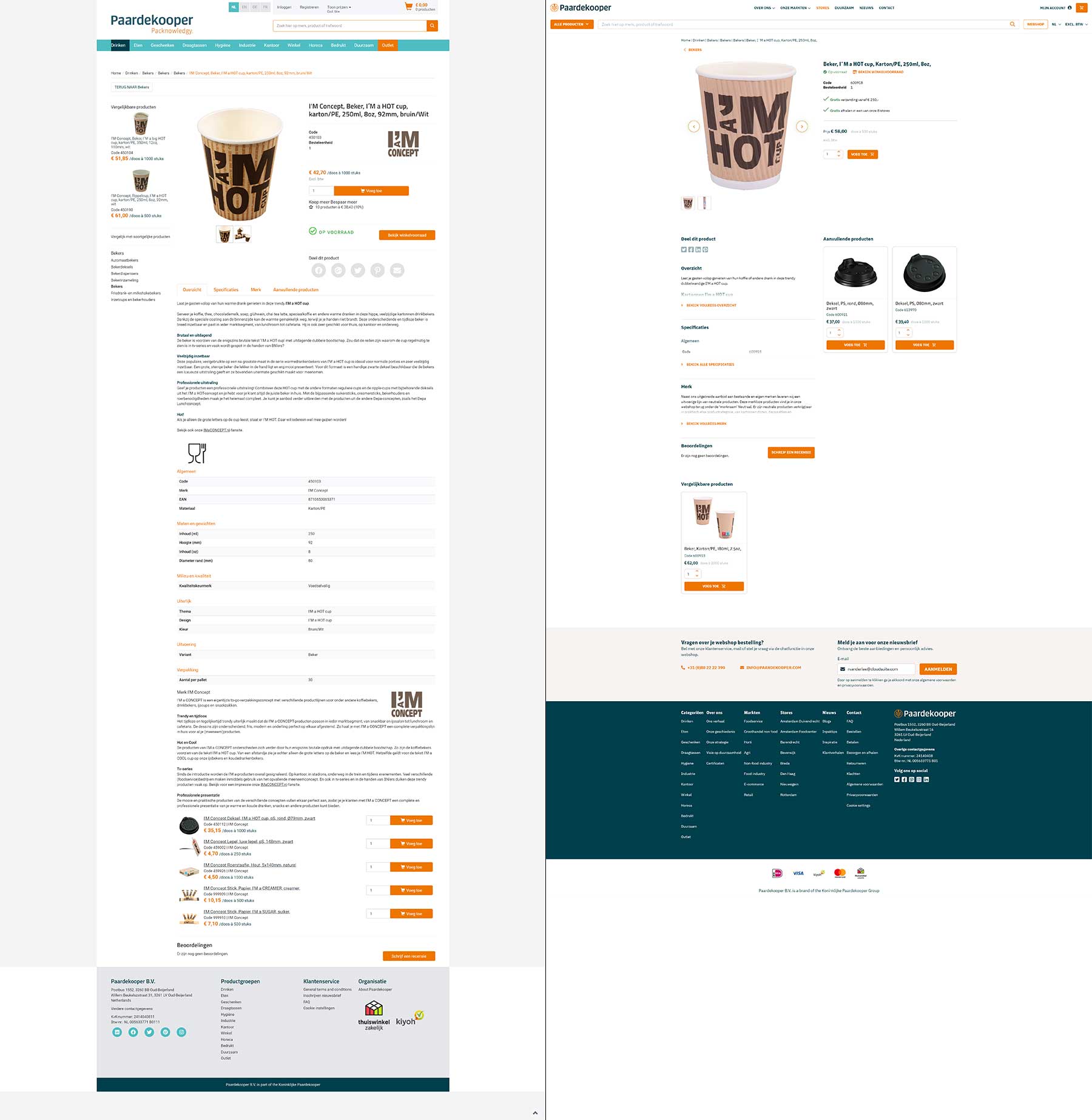
In addition to the homepage, the product detail page has had a major makeover. Paardekooper has always been very good at sharing extensive product information. This allows customers to make a good assessment of whether the product meets their requirements. However, this extensive information can also stagnate the customer journey and distract from its main goal: conversion.
It is noticeable in the new design that extensive attention has been paid to the main purpose of the page. The appearance is calm and the visitor can choose which information is displayed. As a result, the page is basically much shorter and retains the functionalities it previously had, such as additional sales and the range of alternatives.
 EN
EN
 Nederlands