2017 is all about mobile web design. Designers start mobile-first and then adjust their design for laptop and desktop screens. We also see the growing influence of Google’s "Material design", which was specially developed for mobile devices. Read in this article about 9 trends that we will see again this year in web design.
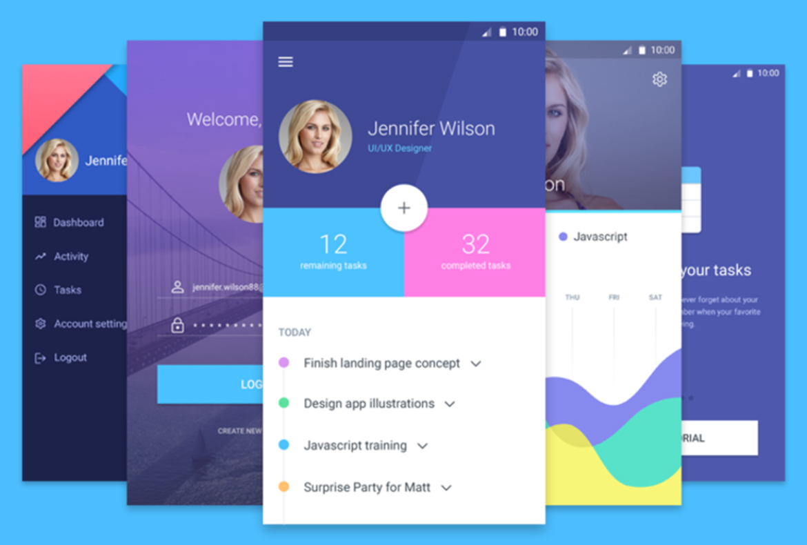
1. INCREASING INFLUENCE MATERIAL DESIGN
Not long ago, Google Material introduced design as a motif for Android devices, but the majority of web designers now work with this style. An intuitive way to shape layouts of mobile applications and e-commerce websites, due to the user-friendly structure. Recognizable elements within material design are the 'card' layouts, responsive animations and effects and the clear structures (buttons, blocks, icons, shadow and fonts). Google has even prepared an online guide with guidelines.
Examples of material design
2. 3D RETURNS
Three-dimensional elements have been allowed again since the introduction of material design, although these are purely functional additions. Designers can 'use' drop shadows, highlights, patterns and round corners again. Purely because that makes elements look more realistic and beautiful.
3. MOBILE-FIRST
A large amount of online purchases are now made via mobile devices. Websites are increasingly being designed primarily for mobile devices (also known as mobile first). We see hamburger menus more and more often on desktop websites, the full width of large screens is used more and pictures, buttons and icons become larger and clearer on larger screens.
4. MOVING GIF IMAGE
The moving GIF image is back, in the form of a "cinemagraph". This is a still image (for example a photo) with a repeating animation, a kind of mini-video. These gifs appear as background images, headers, banners and even as product images. GIF images can also help to communicate better (or: faster) than a text or a video.
Example of GIF
5. LONG SCROLLING AND "LAZY LOADING"
To prevent long loading times, but still be able to respond to user-friendliness, "lazy loading" is increasingly reflected in web design. This means that objects are only loaded when they are needed, i.e. when a user scrolls down.
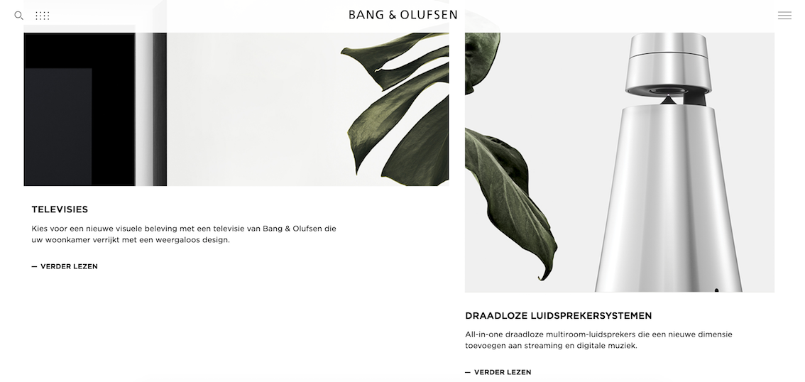
6. STRIKING GRIDS
Although nowadays everything must be clean and tidy, it can also be relevant and creative to deviate elements from the grid. Take a look at this example of Bang & Olufsen.
A good example of a different grid.
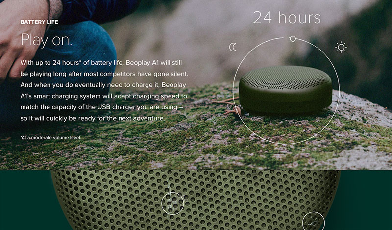
7. PRODUCT PHOTOS IN CONTEXT
Product photos photographed in 360° or in context attract the attention of the visitor. That is why creative product photography will prevail this year.
The Beoplay brand shows product photography in context.
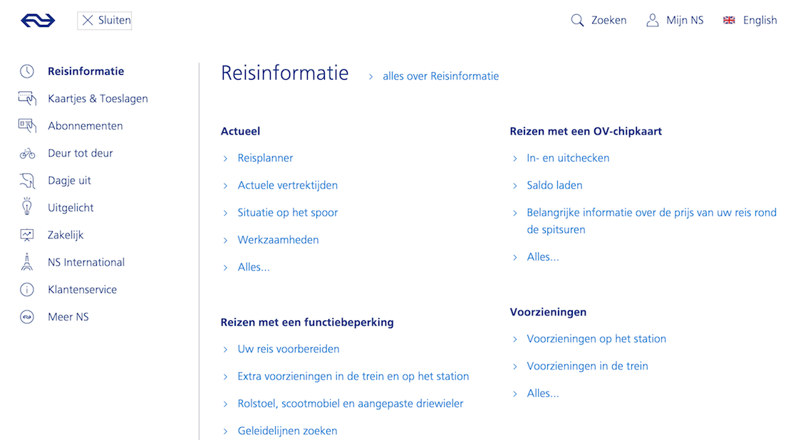
8. FULL SCREEN MENU UNDER THE HAMBURGER MENU
More and more often we see a fullscreen menu that appears as soon as you click on the hamburger menu. The advantage of this is that as a user you can see the complete structure of the website at a glance.
NS.nl works with full screen navigation under the hamburger menu.
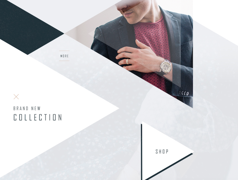
9. GEOMETRIC SHAPES
Triangles, squares and diamonds. We are seeing this retro style more often. It reminds you that you are in the 80s.
You will see geometric shapes more often in web design
 EN
EN
 Nederlands