The smartphone is becoming increasingly dominant in the purchasing process, so we decided to give you some important tips on how to improve your (mobile) webshop.
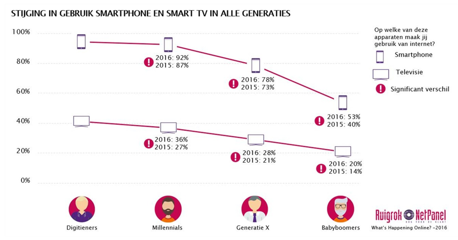
Use of the smartphone to make purchases is not just on the rise among millennials and Generation X (35-55 years) but also among those aged 55 and over – the so-called baby boomers. The Ruigrok NetPanel found that smartphone use among that group rose to 53% in 2016, from 40% in 2015.
Mobile not only brings a lot of traffic to webshops, but mobile purchases are also on the up. Research from PwC shows that in 2016 mobile accounted for 46% of total purchases, up from 40% in 2015. In other words, almost half of those questioned purchased one or more products on several occasions via their mobile device. Despite the fact that most purchases, especially large purchases, are still being made on desktops or laptops, everyone firmly expects the use of mobile will continue to accelerate, certainly when it comes to purchases.
So here are our tips to improve your (mobile) webshop:
A responsive webshop is one that is suitable for all devices on a single URL. The layout of your shop will adapt automatically to the user’s device, ensuring that the information needed by the customer is always legible and workable. A responsive website will also improve search engine optimization: Google, for example, takes account of whether or not a website is mobile-friendly.
Make sure the mobile user gets a focused and simple design. If the content isn’t strictly relevant, leave it out. This takes away a potential source of customer distraction, and allows the shop to load faster.
Try to build a clear and concise menu, with only the most important features of the webshop. If certain components do not belong in the menu structure, place them in the header/footer or use icons. For instance, the home button can be replaced by the hamburger icon; the contact or log-in button can be moved to the top right corner (header).
If there is one thing that matters on mobile it’s the ability to move quickly within the webshop. So make sure users can search quickly and effectively. The search function needs to be made prominent with a large button, striking and less striking colours and legible fonts. Also, try to make the checkout process fast and simple.
Adjust the size of your images to the right format and reduce the quality to shorten the load time of the images, and therefore the webshop. For instance, for images in png format, a handy tool to optimize them is PNGOUT. We also recommend you remove EXIF data (information about the images), because these tend to make the images unnecessarily large.
This involves having a discrete design for every device. In this way, you can manage the design and optimize the user experience separately for each type of device.
When you optimize your responsive webshop, listen carefully to what your customers are telling you. Put yourself in their position. Never forget that customers are using every type of device, so you can make the user experience for every type of customer as smooth and efficient as possible. Because who knows, 2017 could be ‘the year of mobile purchasing’.
 EN
EN
 Nederlands