Creating an effective banner is not so easy. You first need to attract attention, then it must be clicked on. Fortunately, there are some nifty tricks to increase the number of clicks (or click-through rating) on banners. We have listed the following tips and tricks for you.
The click is the main purpose of your banner. Therefore, use a prominent call-to-action button. This is a button to persuade your visitor, after receiving an advertisement, to a specific action. Examples of calls to action are: ‘Buy this car now’, or ‘download the white paper’. Hereby the color of the banner is very important. Because of contrast between the colors the banner becomes more noticeable. To get an idea of successful bannersgood examples can be seen on this website.
An image is worth a thousand words! Therefore, show a product when you promote it. Even more effective is the use of a friendly face. People unconsciously attract attention; our brains are set to human faces and non-verbal communication. Moreover, people stimulate emotions. Research has proven several times. So, increase your conversion with a cute face!
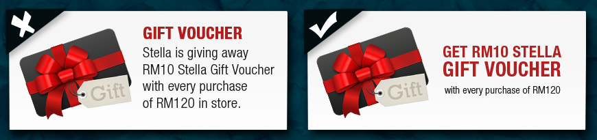
Make the price visible. By mentioning a price or discount you invite potential customers to visit your shop. However, the absence of a price or discount, may cost visitors. This is because the banner is less interesting for them. Read my previously written blog on neuromarketing how round or specific prices influence the purchasing behavior of a visitor.
Although it’s cliché, but ‘less is more’ also applies to banners. Visitors fleetingly scroll through your website. So make sure they can understand in a short amount of time what the message is about. Do this with minimal text, images and colors. Simplicity is often much more effective.
Use readable texts. With a headline (main heading) that stands out and a subtle, attractive subheadline (strapline). Bold fonts stand out more. Vary bold and thin fonts so that they are balanced. Choose fonts and colors to match the rest of the corporate identity, for recognition creates trust.
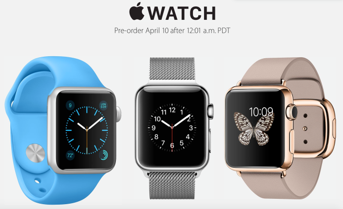
The creation of 'scarcity' is according to the well-known marketing psychologist Cialdini a powerful weapon for influencing indecisive visitors. With ‘only 5 products available’ you generate higher conversion. Apple applied this ‘hunger marketing’ technique on the Apple Watch. Consumers had the illusion that the product was scarce and thus rare. This increased product value. By emphasizing the scarcity of your product or service on the banner, you get the attention of the visitor. This results in higher sales.
Like scarcity, time pressure is according to Cialdini an important factor for click behavior. By providing the visitor with limited time (for example, ‘This action is only available today’) you increase the urge to click. This gives of an increased sense of urgency and encourages clicks.
Text and graphics address different parts of the brain. Search for the right combination. This influences your visitors, both cognitively and emotionally, and continues to have the banner linger longer in one's memory. Swap banners at regular intervals. This prevents boredom amongst visitors in your shop.
Ultimately, it is important to link to a relevant landing page. It is important that potential buyers who click on your banner arrive at a landing page which directly communicates the banner’s message. This leads to a higher conversion rate, a lower bounce rate, and improved customer satisfaction.
 EN
EN
 Nederlands