Design for webshops is changing so fast, it can be hard to keep up. What’s new today is old hat tomorrow. Time to get up to speed on the 10 latest trends.
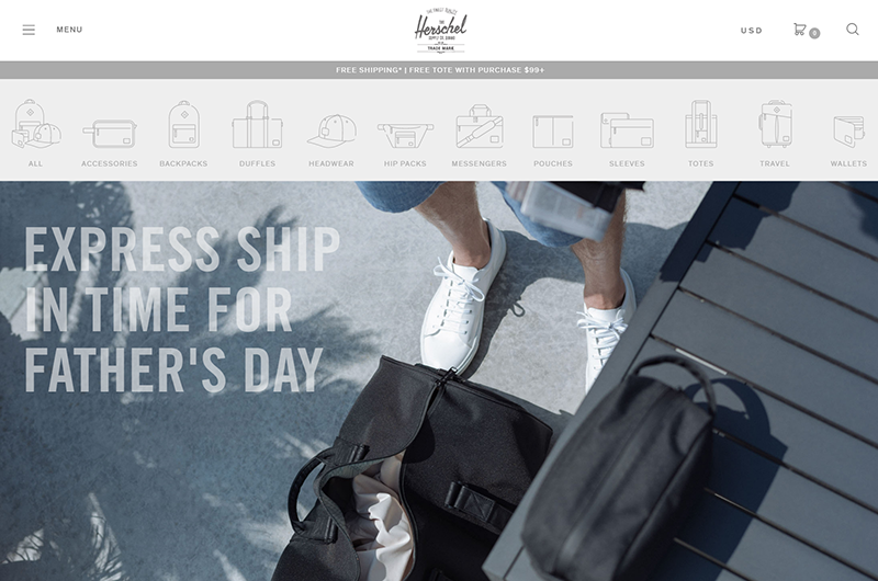
Hidden menus (or hamburger menus) have gained enormously in popularity. With the menu tucked behind three simple stripes, the site seems calmer. less cluttered. In fact, hamburger menus were devised for mobile use, but you’ll come across them more and more often on desktops or tablets.
Did you know that white space on a website increases visitor comprehension by 20%? This according to research from Human Factor International. No surprise then that webshops are increasingly going for a minimalist style and a smart use of white space to show off their wares. This website looks cleaner – and the products appear more exclusive.
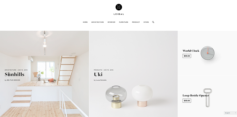
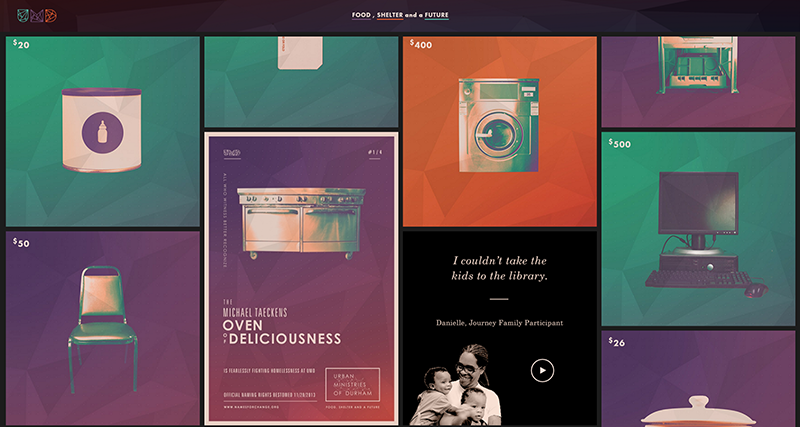
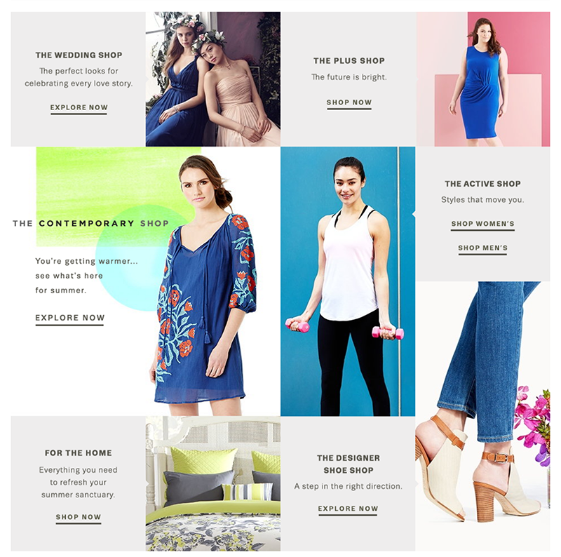
The famous Pinterest-style – or “card layout” – is becoming a go-to design for many well-crafted websshops. One of the advantages of this style is that it’s easy to make responsive as the blocks (or cards) have the perfect size for all devices. They are scalable, and go up and down as the visitor scrolls. No matter if you open the webshop on a desktop or mobile phone, the user experience is the same.
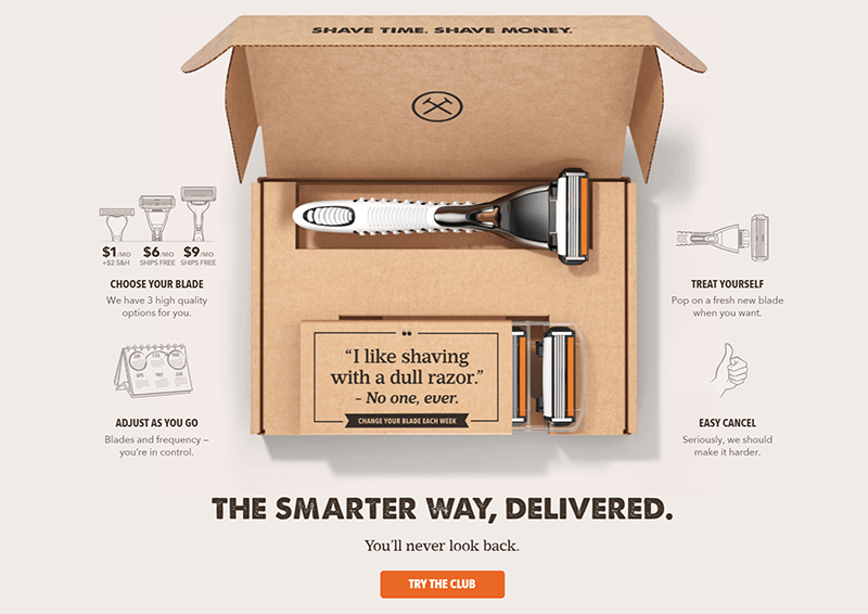
Brands tell stories to stand out from the competition. By combining videos or images with strong text you “narrate” your products, actions or themes in a way that is both compelling and unique. A great story not only heightens the emotional bond between brand and customers, it also boosts loyalty and sales. Storytelling brings a webshop to life.
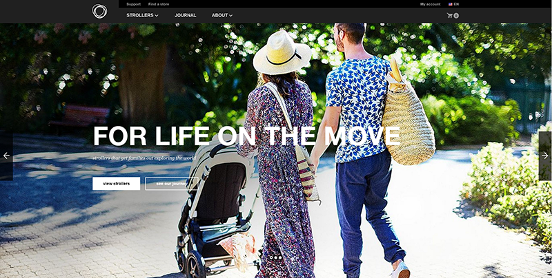
The ‘hero image’ is the first image visitors see when they visit a webshop. This tends to be a large photograph with a call-to-action button. Recent research shows that customers are fascinated by these larger images and will take their time to look at them. Designers are responding to this finding by trying to create a “wow effect” to impress visitors, which results in a higher conversion rate.
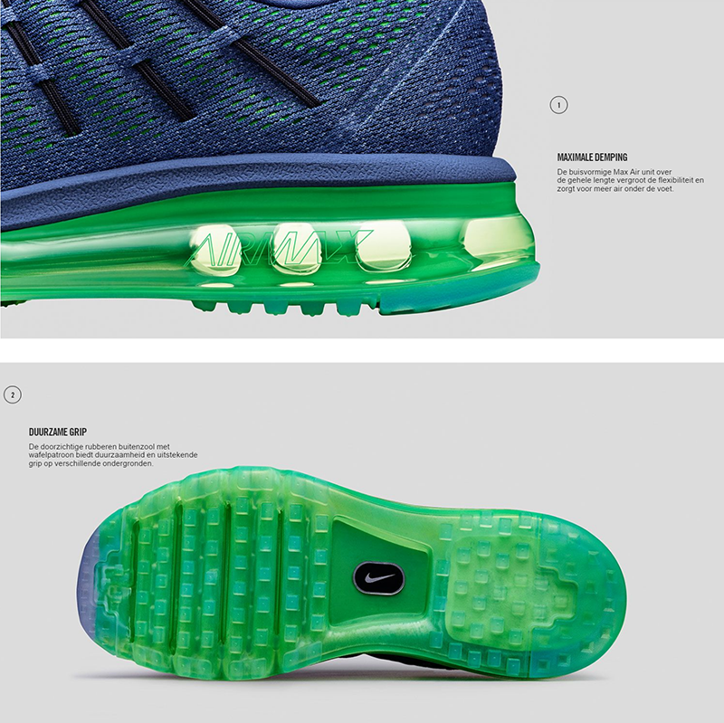
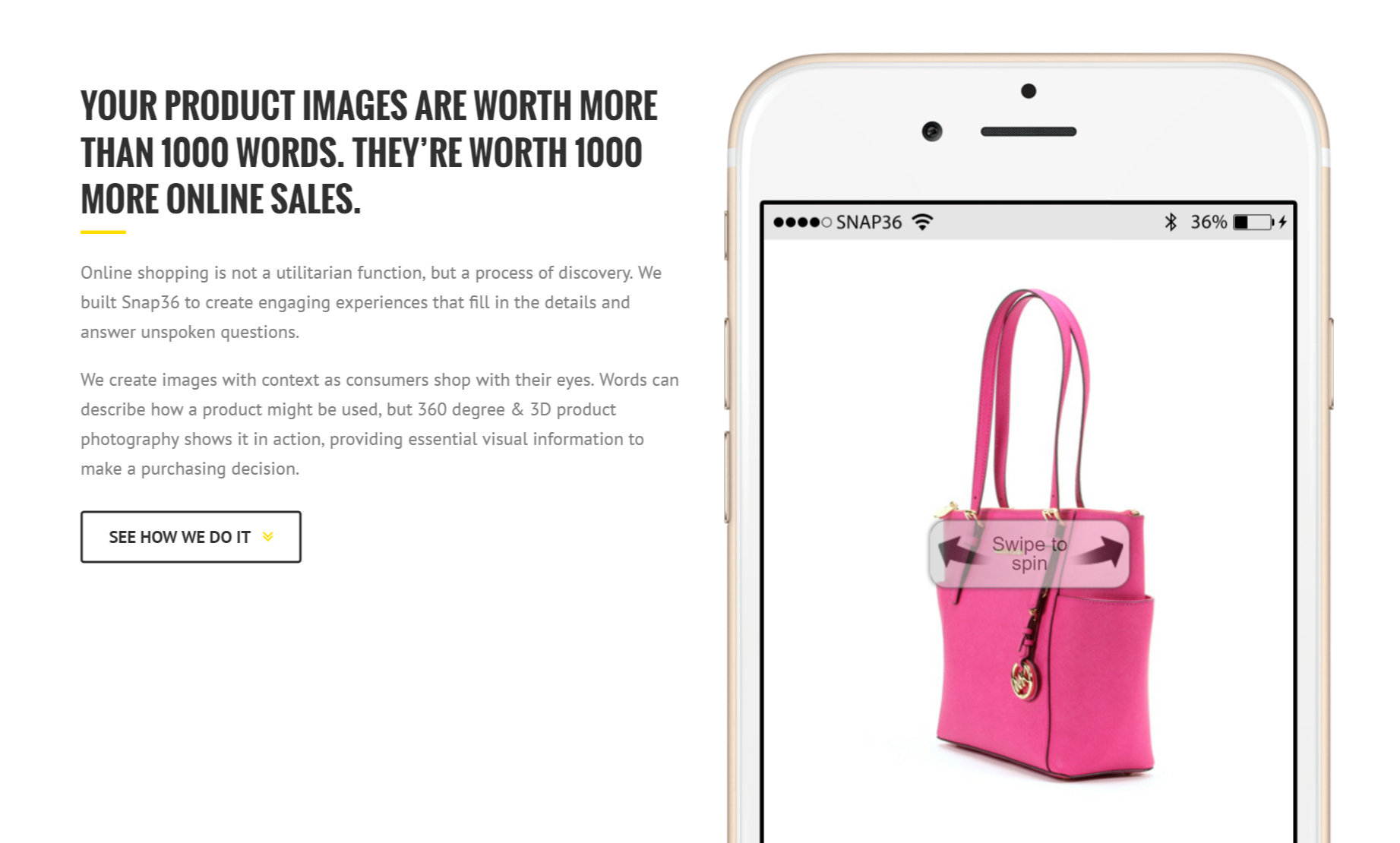
One of the latest trends in ecommerce websites is product demonstration using motion animation. So out with the flat, two-dimensional photograph, in with products as a moving image, preferable in 360°. This creates an unforgettable user experience – one that is especially effective with purchases that have an emotional charge, such as in fashion or life style web shops.
Drop shadows, 3D, glass, blurred colors and complex buttons are yesterday’s news. Big brands are stripping back their webshops with simple icons and surfaces. Everything is as flat as a pancake these days – and so this trend is sometimes dubbed “flat design”. What this gives you is designs that are neat and hip but above all, user-friendly, efficient and restful.
Images have always been important for webshops but the fashion these days is large and professional (background) images across the full width of the screen. By using moody, emotional shots from the same photographer and in the same style, you create a brand-recognizable webshop style.
Designers are going for larger and more flexible fonts. By opting for a new and fresh typeface you are boosting brand recognition. And you no longer need to pay because there are great fonts on Google who gives them out for free to make the web more attractive, more legible and more accessible. And they are doing a pretty good job with a database of 629 fonts and growing. You can download Google Fonts quickly and easily from every website or app.
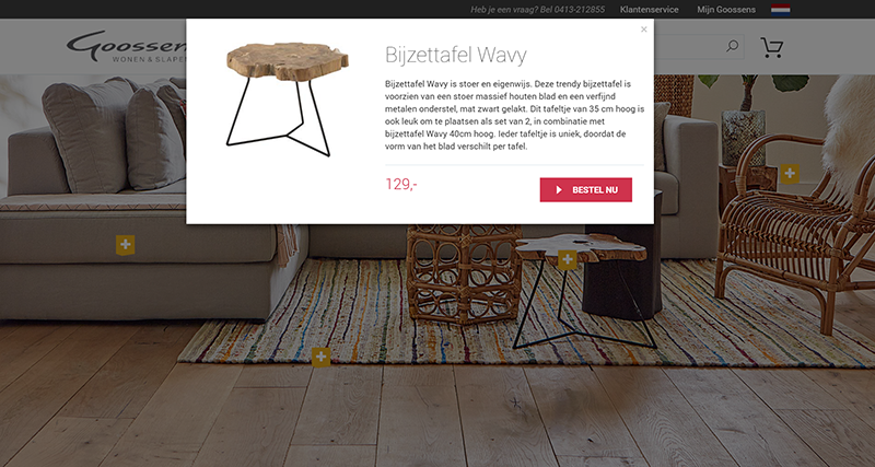
Involving and interactive photographs or videos can make visitors feel they already own a product before they’ve on the buy-button. What to do? Get them to click on a beautiful or evocative image!
Do you have a great example of an innovative web design? Let us know!
Sources
|
 EN
EN
 Nederlands